![[BunsenLabs Logo]](/img/bl.svg)
You are not logged in.
- Topics: Active | Unanswered
#81 2022-03-28 01:54:33
- sleekmason
- zoom

- Registered: 2018-05-22
- Posts: 1,162
- Website
Re: Beryllium Theming
@sleek many thanks for that kind offer!
I guess it depends on how far @hhh is down the road with our current theming ideas...What are the names of those two themes, and where are they?
I understand completely! It is quite the effort to get all of it together. I hope it goes well.
They are Lilidog-Earth and Drow. Taupe may also be of some interest as a base as well. https://github.com/sleekmason/Themes
The Openbox, GTK and Geany themes are all in separate folders. Easiest is probably to git clone the repo, or grab the zip file and simply throw away what you don't want.
The full set of themes range from the kinda strange Lilidog-Neon, down to Lilidog-Bright on the other end of the spectrum. The themes break from dark to light between the Slate and Clay Themes. ![]()
If it happens to work out, just give me a general direction on which one you think might serve as a base, then lighter or darker, any colors if desired, and I'll have a sample in no time from which to begin proper revisions. Afterwords I can adjust the Openbox and Geany themes to match, and we can get recommendations from people for anything they might want to see concerning the overall theme. No worries on any of it:)
Offline
#82 2022-03-28 02:53:00
- hhh
- Miss Grace Jones

- From: Jamaica/Paris/NY
- Registered: 2015-09-17
- Posts: 17,291
- Website
Re: Beryllium Theming
@sleekmason, please submit your themes, on GitHub, DeviantArt or your own host so John can include them (and maybe use one as the default. Use your judgement, John. It won't hurt my feelings.) They're great themes!
The future arrived. Read the terms and conditions.
Offline
#83 2022-03-28 03:57:46
- sleekmason
- zoom
- Registered: 2018-05-22
- Posts: 1,162
- Website
Re: Beryllium Theming
^ Oh cool. If it works out then I am certainly looking forward to it!
You are always welcome to use any of my existing themes and just rename the set, but I can also have a full custom theme set ready for revision in just a few days as well, and the Openbox and Geany themes right after revision. Everything can be reviewed as many times as necessary to get it the way it needs to be for Bunsen Labs.
Some of my existing themes would look really cool just a bit darker and maybe with a color accent related to whatever you want. Easy to change all sorts of stuff rather quickly. Thick Scrollbars? No problem. Thicker yet? Sure! Better contrast for Mousepad and Geany? Why not! All sorts of rapid customisations are possible. Whatever you guys want. ![]()
I'm sure there are some here who also might like to do wallpaper and conky text color revisions after the GTK theme is ready. I'll put a basic wallpaper together to show the theme match, but there are others here who put out great wallpapers to be sure. I hope they will make a few.
This should all take just a few days with revisions, not weeks. Let me know!
Offline
#84 2022-03-28 05:15:03
- johnraff
- nullglob

- From: Nagoya, Japan
- Registered: 2015-09-09
- Posts: 13,353
- Website
Re: Beryllium Theming
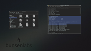
Cloned the GitHub Themes repo... ![]()
...elevator in the Brain Hotel, broken down but just as well...
( a boring Japan blog (currently paused), now on Bluesky, there's also some GitStuff )
Offline
#85 2022-03-28 06:20:13
- johnraff
- nullglob
- From: Nagoya, Japan
- Registered: 2015-09-09
- Posts: 13,353
- Website
Re: Beryllium Theming
I have two earth tone themes like 8bit's post above. One has zero color in it and might be a cool niche theme to use because of that. The other has just a bare minimum of blue throughout, barely visible
They are Lilidog-Earth and Drow. Taupe may also be of some interest...
I couldn't find any, even barely visible, blue in either Earth or Drow. I guess Taupe is the "bare minimum of blue" theme you meant?
...elevator in the Brain Hotel, broken down but just as well...
( a boring Japan blog (currently paused), now on Bluesky, there's also some GitStuff )
Offline
#86 2022-03-28 11:29:11
- sleekmason
- zoom
- Registered: 2018-05-22
- Posts: 1,162
- Website
Re: Beryllium Theming
sleekmason wrote:I have two earth tone themes like 8bit's post above. One has zero color in it and might be a cool niche theme to use because of that. The other has just a bare minimum of blue throughout, barely visible
They are Lilidog-Earth and Drow. Taupe may also be of some interest...
I couldn't find any, even barely visible, blue in either Earth or Drow. I guess Taupe is the "bare minimum of blue" theme you meant?
No, sorry:) Even more nuanced than that. I should have explained better.I made the Drow theme with the concept of having the earth grey tone, but being able to use a small amount of color elsewhere in the theme as well. If you just look at the two themes, you won't see much difference, but all of the text, and a few other minor items in the Drow theme have a hint of color as well. These all range in the 176 -200 hue, (Blue heading towards green) with a saturation of around 8-12.
The Earth theme on the other hand has zero color in it, and unless making a complete theme of the same, tends to look a little funny and washed out. Think Gimp, open in a sea of whatever color and you get the drift. This becomes very evident when using an openbox theme with color associated with Earth.
Darkening either a bit would look cool, but with the Drow theme, adding a single accent color 'should' work alright even though sticking with the earth tone. This one would allow for a slightly better match. Also of interest is that I think the battery life is noticeably different the less color used. (No, not enough to matter really.)
The taupe theme is a mix suited to whatever accent you want without worry, and is probably the most 'advanced' theme in that it was the last one I made.
You are not stuck here at all;) I edit the code itself, and well, . . . What do you want to see?
Hell, give me an accent color choice and I'll make up a couple to check out using both drow and taupe. Gotta go grind some brick here in a few but can make a couple of examples later today.
If no color, I would darken Earth slightly, and tout the hell out of the lack of color as a niche thing for BL. I made that one to use when I am working with Gimp. (I change full themes on the fly). Kept bugging me to open the grey inside so much color.
*EDIT Guessing close to the new Bullseye color for an accent? and maybe another to compare. I'll have some hopefully cool options later to check out:)
Last edited by sleekmason (2022-03-28 11:53:38)
Offline
#87 2022-03-28 19:04:11
- sleekmason
- zoom
- Registered: 2018-05-22
- Posts: 1,162
- Website
Re: Beryllium Theming
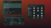
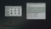
Here are three dark possibilities. These can all change as much as needed in any direction, or another one completely. All three have been darkened just a bit, and the Bullseye Blue color was added to the Current Drow theme. https://github.com/sleekmason/Themes
For those wanting to test, it is probably easiest to just grab the whole themes folder by grabbing the zip file. Click on the "code" button on the github page and download the zip. No need to sandbox. should unzip the folder complete.
Look in NEW-BUNSEN-TEST for the new themes. Pop these into ~/.themes (make the folder if it doesn't exist) to test them. I'm leaving the names 'as is' while I'm working on them, but fully expect you guys to name your own theme whatever you want. I'll pop something with a Bunsen Labs name on it at the end either way.
Anyway, For the moment, if you have Lilidog, testing should be even easier as it will also apply the correct OB theme if using the theme changer.
These are not complete yet:) These will only give you an idea of the accent color, and light/dark. If you have pcmanfm, the old colors will still be there to check out (gtk2).
So! Here is the very first step! I would like as many opinions as can be had please. Everyone has one and it's best to hear as many as possible.
Again, everything is easy to change, and/or if none of these are suitable, tell me what ya want;) After this, it is on to the other portions of the theme, and get folks started on wallpaper and any other changes needed. No reason we can't have this wrapped up in a few days.
These currently use the same scrollbar width I'm using, which is a hair wider than the norm but hardly noticeable. Probably, to really see these clearly, you will have to grab them from the github above, but here is where we are currently.
Last edited by sleekmason (2022-03-28 21:51:51)
Offline
#88 2022-03-28 21:04:46
- sleekmason
- zoom
- Registered: 2018-05-22
- Posts: 1,162
- Website
Re: Beryllium Theming
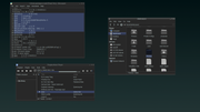
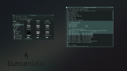
Sorry! Was showing and uploaded the base Earth. Here is the improved version:) Is now updated in the themes github as well.
Last edited by sleekmason (2022-03-28 21:06:29)
Offline
#89 2022-03-28 21:26:41
- Bearded_Blunder
- Dodging A Bullet

- From: Seat: seat0; vc7
- Registered: 2015-09-29
- Posts: 1,146
Re: Beryllium Theming
Not sure my opinion will be that helpful.. but FWIW, as long as we get a new default wallpaper which doesn't make my eyes bleed & it's different enough to instantly distinguish Be from Li I'll be happy enough. I suppose equivalents are needed to tell them apart on sight in grub or lightdm too.
The eye-candy thing really isn't a big deal to me. I don't know where anyone summons the patience from to do theming, maybe the patience also comes with the talent for producing something coherent, which I also lack.
Last edited by Bearded_Blunder (2022-03-28 21:31:15)
Blessed is he who expecteth nothing, for he shall not be disappointed...
If there's an obscure or silly way to break it, but you don't know what.. Just ask me
Offline
#90 2022-03-28 21:29:37
- sleekmason
- zoom
- Registered: 2018-05-22
- Posts: 1,162
- Website
Re: Beryllium Theming
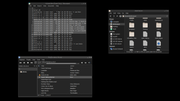
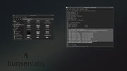
And here is a darker Drow which matches the above theme in accent a bit better. 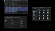
Last edited by sleekmason (2022-03-28 22:03:37)
Offline
#91 2022-03-29 01:48:53
- johnraff
- nullglob
- From: Nagoya, Japan
- Registered: 2015-09-09
- Posts: 13,353
- Website
Re: Beryllium Theming
as long as we get a new default wallpaper which doesn't make my eyes bleed & it's different enough to instantly distinguish Be from Li...
The bottom line. ![]()
...elevator in the Brain Hotel, broken down but just as well...
( a boring Japan blog (currently paused), now on Bluesky, there's also some GitStuff )
Offline
#92 2022-03-29 02:01:17
- DeepDayze
- Like sands through an hourglass...
- From: In Linux Land
- Registered: 2017-05-28
- Posts: 1,987
Re: Beryllium Theming
And here is a darker Drow which matches the above theme in accent a bit better.
https://i.postimg.cc/VrLDrvMG/2022-03-28-162213-1920x1080-scrot.png
I like it...nice dark and somber.
Real Men Use Linux
Offline
#93 2022-03-29 11:17:49
- sleekmason
- zoom
- Registered: 2018-05-22
- Posts: 1,162
- Website
Re: Beryllium Theming
Not sure my opinion will be that helpful.. but FWIW, as long as we get a new default wallpaper which doesn't make my eyes bleed & it's different enough to instantly distinguish Be from Li I'll be happy enough. I suppose equivalents are needed to tell them apart on sight in grub or lightdm too.
The eye-candy thing really isn't a big deal to me. I don't know where anyone summons the patience from to do theming, maybe the patience also comes with the talent for producing something coherent, which I also lack.
Nothing wrong with just replacing the wallpaper too! Yah, the theming is just more building for me. Kinda like masonry. I enjoy the puzzle.
@DeepDayze Thank you for your input! I agree:) These are still prelim, so the smaller items in the theme are not quite colored correctly yet.
@johnraff
No worries here if you just want to wallpaper and call it. The Lithium theme is nice too.
I can have any of the new ones above themed up proper and done in a day, ready to ship, or any of the old ones right now. From the 'black' theme concept you were originally looking into, there are 6 or so here to work off of, changing however you want.
If something different is desired, Blue with pink lines, that's fine too. Just take a couple days longer. I just need insight to get started.
Anyhow, Let me know and I will proceed, and if not, no sweat. I'll still make a Bunsen theme either way if folks want one.
Offline
#94 2022-04-06 06:18:17
- johnraff
- nullglob
- From: Nagoya, Japan
- Registered: 2015-09-09
- Posts: 13,353
- Website
Re: Beryllium Theming
OK I moved some posts out of March Screenshots to here because they were about the upcoming Beryllium theming.
@sleekmason has kindly offered to help us out, and with any luck we'll have a nice graphics stack before long! ![]()
...elevator in the Brain Hotel, broken down but just as well...
( a boring Japan blog (currently paused), now on Bluesky, there's also some GitStuff )
Offline
#95 2022-04-06 21:15:54
- ututo
- Member

- Registered: 2015-09-29
- Posts: 332
Re: Beryllium Theming
my suggestion of a logo conky. If done right, with transparency in the right places, might it not be usable with most wallpapers?
I like this idea very much. Having a logo conky to display with whatever wallpaper you like, even plain colors. It reminds me of that gnome extension that enables fedora logo on the desktop in their workstation release.
I used to do this back in the day (example). It was easier than manipulating the whole wallpaper.
Can't say anything about theming. I go to a Statler/Waldorf/Hydrogen stylish all the way every time i perform a fresh install.
BunsenLabs on deviantArt
Don't touch my git!
Offline
#96 2022-04-07 06:14:51
- johnraff
- nullglob
- From: Nagoya, Japan
- Registered: 2015-09-09
- Posts: 13,353
- Website
Re: Beryllium Theming
Time to get moving.
Wallpaper - if we choose this first, the rest should follow...
The sunrise @hhh started off with was very pretty, but using a photo was considered undesirable.
The red/black abstract was nice, I thought, but not all agreed.
Maybe the safest route is something subdued, grey or blackish?
We already have grey.png in bunsen-images. Its soft and warm:
And @hhh recently made this blackish background:
I kindof like the black one, though I don't know if that logo lends itself into being made into a conky.
The grey might be safer? I'd be OK with either of them.
(Grey.png was the BL Hydrogen background, but with a more modern theme and Papirus icons Beryllium would look pretty different I think.)
Any opinions? Especially, @sleekmason?
...elevator in the Brain Hotel, broken down but just as well...
( a boring Japan blog (currently paused), now on Bluesky, there's also some GitStuff )
Offline
#97 2022-04-07 06:53:58
- Bearded_Blunder
- Dodging A Bullet
- From: Seat: seat0; vc7
- Registered: 2015-09-29
- Posts: 1,146
Re: Beryllium Theming
I like the second one too.
There's also something to be said for wallpapers that include the logo, resource constrained users may choose to run without conky active, or just one conky if the logo is envisaged as a second.
Much as I like the idea of a conky logo that'll work with most wallpaper, I also like the idea of branded wallpaper that doesn't require conky.
Blessed is he who expecteth nothing, for he shall not be disappointed...
If there's an obscure or silly way to break it, but you don't know what.. Just ask me
Offline
#98 2022-04-07 13:17:17
- sleekmason
- zoom
- Registered: 2018-05-22
- Posts: 1,162
- Website
Re: Beryllium Theming
I also like the second one! Very comfortable to look at, and the logo is large enough to see in screenshots proper without overpowering the wall. Nice work:) Plus the pattern removes the line artifacts in a transparent terminal. The conky bit is cool as hell, but really should just be a neat option provided, rather than the main, due to some folks never using Conky. I'd make a nifty button for it somewhere.
Anyhow, If this winds up being the wallpaper choice, than I can suggest a few items to look through, and upon a selection, can make a couple of further options, onward and onward until we get as close to what people would like to see as possible.
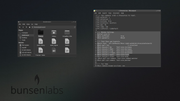
Based on the second wallpaper, here are a few samples that can be changed in any direction desired. Literally telling me "darker" "lighter" "More tint" etc. is what I need to get the concept.
I don't mind changes at all, or criticism. Please do. If none of these serve at all as a base, point me in another direction. No problem. We want this right. Right? ![]() And of course if there is some other theme that works better, Great!
And of course if there is some other theme that works better, Great!
Last edited by sleekmason (2022-04-07 14:18:34)
Offline
#99 2022-04-07 14:38:37
- Bearded_Blunder
- Dodging A Bullet
- From: Seat: seat0; vc7
- Registered: 2015-09-29
- Posts: 1,146
Re: Beryllium Theming
Nice samples, I could certainly live with something like any of the last 3, with or without more colourful icons.
Blessed is he who expecteth nothing, for he shall not be disappointed...
If there's an obscure or silly way to break it, but you don't know what.. Just ask me
Offline
#100 2022-04-07 15:59:45
- deleted0
- Guest
Re: Beryllium Theming
I'll just leave this here.
