![[BunsenLabs Logo]](/img/bl.svg)
You are not logged in.
- Topics: Active | Unanswered
#1 2019-01-16 17:34:28
- jimjamz
- Member
- From: Nagasaki, Japan
- Registered: 2016-04-04
- Posts: 190
Crocus-Remix theme - Close icon colour on the File Manager tabs
I haven't raised any issues in relation to GUI issues before so I don't know if this is the correct process or not. Please advise.
When using said theme, and having multiple tabs open in the File Manager, they are difficult to see, and almost impossible to see if using redshift with even the slightest gamma reduction: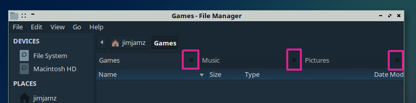
The 'X' colour probably needs to be revised. Perhaps a similar colour to the foreground window text?
Offline
#2 2019-01-16 19:43:47
- damo
- ....moderator....

- Registered: 2015-08-20
- Posts: 6,734
Re: Crocus-Remix theme - Close icon colour on the File Manager tabs
Have you changed the icon theme as well, to suit a dark theme? Many come with light/dark variants.
Be Excellent to Each Other...
The Bunsenlabs Lithium Desktop » Here
FORUM RULES and posting guidelines «» Help page for forum post formatting
Artwork on DeviantArt «» BunsenLabs on DeviantArt
Offline
#3 2019-01-16 20:57:07
- ohnonot
- ...again

- Registered: 2015-09-29
- Posts: 5,592
Re: Crocus-Remix theme - Close icon colour on the File Manager tabs
that X is defined by the icon theme, not the GTK theme.
Offline

#5 2019-01-17 11:43:04
- jimjamz
- Member
- From: Nagasaki, Japan
- Registered: 2016-04-04
- Posts: 190
Re: Crocus-Remix theme - Close icon colour on the File Manager tabs
that X is defined by the icon theme, not the GTK theme.
I totally didn't think about that! Yes, it is the icon theme that is responsible for it. Basically anything that is Paper (Paper-*) is causing the 'X' to be too dark. GNOME icon themes give a much lighter X that is visible on the dark theme. So even Paper-mono-dark is not entirely appropriate for dark themes.
Offline
#6 2019-01-17 17:25:36
- ohnonot
- ...again
- Registered: 2015-09-29
- Posts: 5,592
Re: Crocus-Remix theme - Close icon colour on the File Manager tabs
I know of only one icon theme that caters to all "shades of darkness", that's Faenza (*):
it has -dark, -darker, -darkest versions.
try it out, in my experience one always fits (of course it's a different style than paper).
(*) that and its continuation Delft which I have been using for a long while now. recommended.
Offline
#7 2019-01-19 17:59:19
- jimjamz
- Member
- From: Nagasaki, Japan
- Registered: 2016-04-04
- Posts: 190
Re: Crocus-Remix theme - Close icon colour on the File Manager tabs
I know of only one icon theme that caters to all "shades of darkness", that's Faenza (*):
it has -dark, -darker, -darkest versions.
try it out, in my experience one always fits (of course it's a different style than paper).(*) that and its continuation Delft which I have been using for a long while now. recommended.
Thank you for this recommendation. I will check it out.
Offline
#8 2019-01-21 19:44:22
- jimjamz
- Member
- From: Nagasaki, Japan
- Registered: 2016-04-04
- Posts: 190
Re: Crocus-Remix theme - Close icon colour on the File Manager tabs
I know of only one icon theme that caters to all "shades of darkness", that's Faenza (*):
it has -dark, -darker, -darkest versions.
try it out, in my experience one always fits (of course it's a different style than paper).(*) that and its continuation Delft which I have been using for a long while now. recommended.
Much, much better! Although, I would like to make some suggestions to the authors for their choice of icons for certain items.
For example, I think the GNOME/Paper theme icon (left) for a connected mobile device is more appropriate than the Delft selection (right):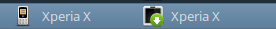
Offline
#9 2019-01-21 20:52:54
- damo
- ....moderator....
- Registered: 2015-08-20
- Posts: 6,734
Re: Crocus-Remix theme - Close icon colour on the File Manager tabs
^ Just replace every occurrence of the icon with the one you like (of the appropriate sizes).
Be Excellent to Each Other...
The Bunsenlabs Lithium Desktop » Here
FORUM RULES and posting guidelines «» Help page for forum post formatting
Artwork on DeviantArt «» BunsenLabs on DeviantArt
Offline