![[BunsenLabs Logo]](/img/bl.svg)
You are not logged in.
- Topics: Active | Unanswered
#1 2024-04-04 03:10:08
- Su1_Gener1s
- Member
- Registered: 2020-11-01
- Posts: 16
Odd colour choice for certain aspects?
Morning all,
I'm loving the Boron release so far, I use it on lower-end PC's I refurbish for a charity I work for, have done since Deuterium and every release is a little more polished than the last (there were, I seem to remember, quite a few tweaks necessary on Deuterium!).
But I've run into a quirk that I just can't seem to figure out how to fix.
There are certain highlighted portions of the GUI on the Boron Aqua theme that just don't seem to fit, namely the Trash empty area (see attached image) and if you should fail the password at the login screen, both are highlighted in this god-awful purple colour that is very difficult to read the text on and doesn't seem to fit with the "aqua" theme at all.
I've managed to figure out it is part of the GTK theming area, if I change the GTK theme to anything other than the "Aqua" line? It shows up as something more sensible.
How do I fix this? I've got gtkinspector running but I've absolutely no clue what I'm looking for or what to poke to change the colour...or even if it's possible to do though GTK inspector (a little knowledge is a dangerous thing!).

Offline
#2 2024-04-04 03:41:34
- hhh
- Miss Grace Jones

- From: Jamaica/Paris/NY
- Registered: 2015-09-17
- Posts: 17,291
- Website
Re: Odd colour choice for certain aspects?
I don't have a BL install at the moment, but I can put it on a Virtual Machine tomorrow to test.
In the meantime, what's it look like if you switch to a standard theme like GNOME or Adwaita?
The future arrived. Read the terms and conditions.
Offline
#3 2024-04-04 04:00:24
- Su1_Gener1s
- Member
- Registered: 2020-11-01
- Posts: 16
Re: Odd colour choice for certain aspects?
In the meantime, what's it look like if you switch to a standard theme like GNOME or Adwaita?
Awesome, thank you for looking into it! Really appreciate it.
Changing to anything other than the "Boron Aqua" line changes the highlight colour to something more sensible, e.g. Adwaita results in a cream highlight, grey buttons, black text, Adwaita-dark is a browny-grey highlight, black buttons, white text.
Just seems to be the Boron Aqua theme, both regular and light flavours.
Offline
#4 2024-04-04 20:40:56
- hhh
- Miss Grace Jones
- From: Jamaica/Paris/NY
- Registered: 2015-09-17
- Posts: 17,291
- Website
Re: Odd colour choice for certain aspects?
I was hoping this would be something easy like changing info-background or warning-background in the gtk-3.20 gtk.css file, but I'm not having any luck so far. I poked a little at the files in Dragon as well, since Trash looks fine in that theme, but my changes didn't produce anything.
I'll keep digging as time allows and post back.
The future arrived. Read the terms and conditions.
Offline
#5 2024-04-05 01:42:26
- johnraff
- nullglob

- From: Nagoya, Japan
- Registered: 2015-09-09
- Posts: 13,352
- Website
Re: Odd colour choice for certain aspects?
GTK theming is outside my comfort zone, but isn't the Trash icon coming from the icon theme?
...elevator in the Brain Hotel, broken down but just as well...
( a boring Japan blog (currently paused), now on Bluesky, there's also some GitStuff )
Offline
#6 2024-04-05 02:29:22
- sleekmason
- zoom

- Registered: 2018-05-22
- Posts: 1,162
- Website
Re: Odd colour choice for certain aspects?
For dragon, the line controlling this color would be on line 3996 of the gtk-3.0/gtk-contained.css (plus or minus a line or two).
In dragons case it is this background line:
background-color: #383E40;as part of this section:
/**************
 * GtkInfoBar *
 **************/
infobar {
  border-style: none; }

.info,
.question,
.warning,
.error {
  text-shadow: 0 1px #2C2F30; }
  .info:backdrop, .info,
  .question:backdrop,
  .question,
  .warning:backdrop,
  .warning,
  .error:backdrop,
  .error {
    background-color: #383E40;
However, there are other possibilities depending on how it is called in the BL theme. For example, it is also:
gtk-secondary-caret-color: #383E40How this fits with the current BL theme may be different. In dragon there are 40 instances or so of it being used.
It is also the same color used for the warning color in a root thunar instance.
I'm downloading a BL instance now and will take a look unless you get it figured first.
edit- it looks like it is globbed with the buttons in the same location in both dragon and the bl theme ...
Last edited by sleekmason (2024-04-05 02:37:01)
Offline
#7 2024-04-05 02:36:16
- hhh
- Miss Grace Jones
- From: Jamaica/Paris/NY
- Registered: 2015-09-17
- Posts: 17,291
- Website
Re: Odd colour choice for certain aspects?
GTK theming is outside my comfort zone, but isn't the Trash icon coming from the icon theme?
Not the icon, the purple background at the bottom of the window, where the "Delete" and "Restore" buttons are.
@sleekmason, thanks. I was hoping you'd chime in!
The OP also mentioned the login failure message background and I agree that, while at least easily readable, it's not the best color.
The future arrived. Read the terms and conditions.
Offline
#8 2024-04-05 02:44:19
- sleekmason
- zoom
- Registered: 2018-05-22
- Posts: 1,162
- Website
Re: Odd colour choice for certain aspects?
Well sure.) got it downloaded and switching here in a sec. The login failure message will be part of a root instance making it slightly harder to track down, maybe. Just means that any adjustment has to be moved to /usr/share/icons before seeing the result. Guess I need to just look. Hopefully I'll have something here in a bit.
Last edited by sleekmason (2024-04-05 04:35:10)
Offline
#9 2024-04-05 03:06:03
- hhh
- Miss Grace Jones
- From: Jamaica/Paris/NY
- Registered: 2015-09-17
- Posts: 17,291
- Website
Re: Odd colour choice for certain aspects?
So, the section for .inforbar in the Aqua themes (which are Numix themes produced by Oomox with some fixes) is dozens of lines long, but you can midigate some of the ugliness by changing background color in line #3679.
I can't find the text-color or foreground-color or color line for the buttins, though, so a very light background color still only produces a bit of contrast with what is a very dull grey text color. Something like #ffbebe for the background will make it tolerable, I think, but use whatever color you like, @Su1.
It's getting late where I am, I'll have to pick up this discussion tomorrow.
The future arrived. Read the terms and conditions.
Offline
#10 2024-04-05 04:33:46
- sleekmason
- zoom
- Registered: 2018-05-22
- Posts: 1,162
- Website
Re: Odd colour choice for certain aspects?
^ Yep! that is the location. Here's the basics for all that is needed. Adjust any and all as desired. 
To keep it simple, Make a backup of the existing Boron-aqua/gtk-3.20/gtk.css and then copy lines 3670 through 3796 of Boron-aqua/gtk-3.20/gtk.css from the below code to get what I have in the screenshot.
Change as desired. Do a diff for reference if wanting to see what was changed. ( I use 'meld' for this kind of stuff.) These changes can and will affect other areas, though should work out okay overall. I guess it depends on what you want to see.):
/*********
 ! Infobar
**********/
infobar {
  border: 0; }
  infobar.info, infobar.info:backdrop, label:backdrop selection.info {
    background-color: #498D9E;
    background-image: none;
    border: 1px solid #172124;
    caret-color: currentColor; }
    infobar.info label, infobar.info, infobar.info:backdrop label, label:backdrop selection.info label, infobar.info:backdrop, label:backdrop selection.info {
      color: #242424; }
  infobar.info button, infobar.info button.nautilus-circular-button.image-button {
    background-color: #65C1D9;
    background-image: none;
    border-color: rgba(44, 44, 44, 0.32);
    color: #1A1A1A;
    box-shadow: 0 1px 2px -1px rgba(49, 49, 49, 0.22); }
    infobar.info button:focus, infobar.info button:hover {
      border-color: mix(#53a0b3,rgba(55, 55, 55, 0.32),0.3); }
    infobar.info button:active, infobar.info button:active:hover, infobar.info button:active:focus, infobar.info button:active:hover:focus, infobar.info button:checked, infobar.info button:checked:hover, infobar.info button:checked:focus, infobar.info button:checked:hover:focus {
      border-color: rgba(39, 39, 39, 0.32); }
    infobar.info button:disabled {
      border-color: rgba(47, 47, 47, 0.32); }
    infobar.info button:active:disabled, infobar.info label:disabled selection:active, label:disabled infobar.info selection:active, infobar.info button:checked:disabled, infobar.info label:disabled selection:checked, label:disabled infobar.info selection:checked {
      border-color: rgba(44, 44, 44, 0.32); }
    .linked:not(.vertical) > infobar.info button:not(:last-child):not(:only-child), .linked:not(.vertical) > :not(:last-child):not(:only-child) infobar.info button, stackswitcher:not(.vertical) > infobar.info button:not(:last-child):not(:only-child) {
      border-right-style: none; }
      .linked:not(.vertical) > infobar.info button:not(:last-child):not(:only-child):hover, .linked:not(.vertical) > :not(:last-child):not(:only-child) infobar.info button:hover, stackswitcher:not(.vertical) > infobar.info button:not(:last-child):not(:only-child):hover {
        border-color: mix(#53a0b3,rgba(55, 55, 55, 0.3),0.3);
        border-right-style: none;
        box-shadow: inset-1px 0 0 mix(#53a0b3,rgba(55, 55, 55, 0.3),0.3); }
    .linked:not(.vertical) > infobar.info button:not(:last-child):not(:only-child):checked, .linked:not(.vertical) > :not(:last-child):not(:only-child) infobar.info button:checked, stackswitcher:not(.vertical) > infobar.info button:not(:last-child):not(:only-child):checked {
      border-right-style: none; }
      .linked:not(.vertical) > infobar.info button:not(:last-child):not(:only-child):checked:hover, .linked:not(.vertical) > :not(:last-child):not(:only-child) infobar.info button:checked:hover, stackswitcher:not(.vertical) > infobar.info button:not(:last-child):not(:only-child):checked:hover {
        border-color: mix(#53a0b3,rgba(83, 160, 179, 0.3),0.3);
        border-right-style: none;
        box-shadow: inset-1px 0 0 mix(#53a0b3,rgba(83, 160, 179, 0.3),0.3); }
    .linked.vertical > infobar.info button:not(:last-child):not(:only-child), .linked.vertical > :not(:last-child):not(:only-child) infobar.info button, stackswitcher.vertical > infobar.info button:not(:last-child):not(:only-child) {
      border-bottom-style: none; }
      .linked.vertical > infobar.info button:not(:last-child):not(:only-child):hover, .linked.vertical > :not(:last-child):not(:only-child) infobar.info button:hover, stackswitcher.vertical > infobar.info button:not(:last-child):not(:only-child):hover {
        border-color: mix(#53a0b3,rgba(55, 55, 55, 0.3),0.3);
        border-bottom-style: none;
        box-shadow: inset 0 -1px mix(#53a0b3,rgba(55, 55, 55, 0.3),0.3); }
    .linked.vertical > infobar.info button:not(:last-child):not(:only-child):checked, .linked.vertical > :not(:last-child):not(:only-child) infobar.info button:checked, stackswitcher.vertical > infobar.info button:not(:last-child):not(:only-child):checked {
      border-bottom-style: none; }
      .linked.vertical > infobar.info button:not(:last-child):not(:only-child):checked:hover, .linked.vertical > :not(:last-child):not(:only-child) infobar.info button:checked:hover, stackswitcher.vertical > infobar.info button:not(:last-child):not(:only-child):checked:hover {
        border-color: mix(#53a0b3,rgba(83, 160, 179, 0.3),0.3);
        border-bottom-style: none;
        box-shadow: inset 0 -1px mix(#53a0b3,rgba(83, 160, 179, 0.3),0.3); }
    infobar.info button.flat {
      color: #1A1A1A;
      border-color: rgba(115, 34, 219, 0);
      background-color: rgba(115, 34, 219, 0);
      background-image: none;
      box-shadow: none; }
    infobar.info button:hover, infobar.info button.flat:hover {
      background-color: #56AEC4;
      background-image: none;
      border-color: rgba(44, 44, 44, 0.4);
      color: #1A1A1A;
      box-shadow: 0 1px 2px -1px rgba(49, 49, 49, 0.32); }
      infobar.info button:hover:focus, infobar.info button:hover:hover, infobar.info button.flat:hover:focus, infobar.info button.flat:hover:hover {
        border-color: mix(#53a0b3,rgba(55, 55, 55, 0.4),0.3); }
      infobar.info button:hover:active, infobar.info button:hover:active:focus, infobar.info button.flat:hover:active:focus, infobar.info button:hover:checked, infobar.info button:hover:checked:focus, infobar.info button.flat:hover:checked:focus, infobar.info button.flat:hover:active, infobar.info button.flat:hover:active:hover:focus, infobar.info button.flat:hover:checked, infobar.info button.flat:hover:checked:hover:focus {
        border-color: rgba(39, 39, 39, 0.4); }
      infobar.info button:hover:disabled, infobar.info label:disabled selection:hover, label:disabled infobar.info selection:hover, infobar.info button.flat:hover:disabled {
        border-color: rgba(47, 47, 47, 0.4); }
      infobar.info button:hover:active:disabled, infobar.info label:disabled selection:active, label:disabled infobar.info selection:active, infobar.info button:hover:checked:disabled, infobar.info label:disabled selection:checked, label:disabled infobar.info selection:checked, infobar.info button.flat:hover:active:disabled, infobar.info button.flat:hover:checked:disabled {
        border-color: rgba(44, 44, 44, 0.4); }
    infobar.info button:focus, infobar.info button.flat:focus {
      background-color: #4D94A6;
      background-image: none;
      border-color: rgba(55, 55, 55, 0.32);
      outline-color: rgba(83, 160, 179, 0.5);
      outline-width: 1px;
      outline-style: solid;
      outline-offset: -3px;
      color: #1A1A1A;
      box-shadow: 0 1px 2px -1px rgba(49, 49, 49, 0.42); }
      infobar.info button:focus:hover, infobar.info button.flat:focus:hover {
        background-color: #65C1D9;
        background-image: none;
        border-color: rgba(44, 44, 44, 0.4);
        box-shadow: 0 1px 2px -1px rgba(49, 49, 49, 0.48); }
        infobar.info button:focus:hover:hover, infobar.info button.flat:focus:hover:hover {
          border-color: mix(#53a0b3,rgba(55, 55, 55, 0.4),0.3); }
        infobar.info button:focus:hover:active, infobar.info button.flat:focus:hover:active, infobar.info button.flat:focus:hover:active:focus, infobar.info button:focus:hover:checked, infobar.info button.flat:focus:hover:checked, infobar.info button.flat:focus:hover:checked:focus, infobar.info button.flat:focus:hover:active:hover:focus, infobar.info button.flat:focus:hover:checked:hover:focus {
          border-color: rgba(39, 39, 39, 0.4); }
        infobar.info button:focus:hover:disabled, infobar.info label:disabled selection:hover, label:disabled infobar.info selection:hover, infobar.info button.flat:focus:hover:disabled {
          border-color: rgba(47, 47, 47, 0.4); }
        infobar.info button:focus:hover:active:disabled, infobar.info label:disabled selection:active, label:disabled infobar.info selection:active, infobar.info button:focus:hover:checked:disabled, infobar.info label:disabled selection:checked, label:disabled infobar.info selection:checked, infobar.info button.flat:focus:hover:active:disabled, infobar.info button.flat:focus:hover:checked:disabled {
          border-color: rgba(44, 44, 44, 0.4); }
    infobar.info button:checked, infobar.info button:active, infobar.info button.flat:checked, infobar.info button.flat:active {
      /*@include linear-gradient(shade($bg, .7), to top);*/
      background-color: #53a0b3;
      background-image: none;
      border-color: rgba(44, 44, 44, 0.32);
      color: #ffffff;
      box-shadow: inset 1px 0 rgba(55, 55, 55, 0.06), inset 0 1px rgba(55, 55, 55, 0.07), inset -1px 0 rgba(55, 55, 55, 0.06), inset 0 -1px rgba(55, 55, 55, 0.05); }
      infobar.info button:checked:focus, infobar.info button:checked:hover, infobar.info button:active:focus, infobar.info button:active:hover, infobar.info button.flat:checked:focus, infobar.info button.flat:checked:hover, infobar.info button.flat:active:focus, infobar.info button.flat:active:hover {
        border-color: mix(#53a0b3,rgba(55, 55, 55, 0.32),0.3); }
      infobar.info button:active:checked, infobar.info button:active:checked:hover, infobar.info button:active:checked:focus, infobar.info button:active:checked:hover:focus, infobar.info button.flat:active:checked, infobar.info button.flat:active:checked:hover, infobar.info button.flat:active:checked:focus, infobar.info button.flat:active:checked:hover:focus {
        border-color: rgba(39, 39, 39, 0.32); }
      infobar.info button:checked:disabled, infobar.info label:disabled selection:checked, label:disabled infobar.info selection:checked, infobar.info button:active:disabled, infobar.info label:disabled selection:active, label:disabled infobar.info selection:active, infobar.info button.flat:checked:disabled, infobar.info button.flat:active:disabled {
        border-color: rgba(47, 47, 47, 0.32); }
      infobar.info button:checked:active:disabled, infobar.info label:disabled selection:active, label:disabled infobar.info selection:active, infobar.info button:checked:checked:disabled, infobar.info label:disabled selection:checked, label:disabled infobar.info selection:checked, infobar.info button:active:checked:disabled, infobar.info button.flat:active:checked:disabled {
        border-color: rgba(44, 44, 44, 0.32); }
      infobar.info button:checked:focus, infobar.info button:checked:hover, infobar.info button:active:focus, infobar.info button:active:hover, infobar.info button.flat:checked:focus, infobar.info button.flat:checked:hover, infobar.info button.flat:active:focus, infobar.info button.flat:active:hover {
        /*@include linear-gradient(shade($bg, .65), to top);*/
        background-color: #5ca5b7;
        background-image: none;
        color: #ffffff; }
    infobar.info button:focus, infobar.info button:hover, infobar.info button.flat:focus, infobar.info button.flat:hover {
      color: #1A1A1A; }
    infobar.info button:disabled:disabled, infobar.info button.flat:disabled:disabled, infobar.info label:disabled selection.flat, label:disabled infobar.info selection.flat {
      background-color: alpha(mix(#6DD1EB,#ADADAD,0.2),0.4);
      background-image: none;
      /*border: 1px solid alpha($bg, .2);*/
      opacity: .6;
      color: mix(#1C353D,#1A1A1A,0.6);
      box-shadow: none; }
      infobar.info button:disabled:disabled :disabled, infobar.info button:disabled:disabled label:disabled selection, label:disabled infobar.info button:disabled:disabled selection, infobar.info button.flat:disabled:disabled :disabled, infobar.info label:disabled selection.flat :disabled, label:disabled infobar.info selection.flat :disabled, infobar.info label:disabled selection.flat selection, label:disabled infobar.info selection.flat selection {
        color: mix(#1C353D,#1A1A1A,0.6); }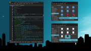
If you need specifics for any of the above, just let me know. I'll look up the login failure message too if I can figure it.
Offline
#11 2024-04-05 04:55:25
- Su1_Gener1s
- Member
- Registered: 2020-11-01
- Posts: 16
Re: Odd colour choice for certain aspects?
I'm so glad I didn't post a "Doh! I should've thought of that..." question. 
I've got to think the purple choice was an oversight in the theme build, can't believe it was a purposeful choice!
Thank you all for your input so far, I haven't got time to fiddle about with it right now but I hope I can spend some time this evening to.
Offline
#12 2024-04-05 05:47:15
- sleekmason
- zoom
- Registered: 2018-05-22
- Posts: 1,162
- Website
Re: Odd colour choice for certain aspects?
For the login error color if I understand correctly - #D12285 is the hot pink warning color and is located in many places in the Boron-aqua/gtk-3.20/gtk.css for different warnings. Use the search function in Geany to see where. It in every location if desired using the replace function in geany.
Be aware that changing the color below needs to be done in /usr/share/themes/Boron-aqua/gtk-3.20/gtk.css. So make sure to make a copy of the theme. Generally it's best to make changes from ~/.themes (add the theme there to edit), but in this particular case, it is read from root when logging in so is required in /usr/share/themes. Adjust as desired.
Change lines 4072 and 4074 as an example, from:
infobar.error, infobar.error:backdrop, label:backdrop selection.error {
    background-color: #D12285;
    background-image: none;
    border: 1px solid #D12285;
to:
infobar.error, infobar.error:backdrop, label:backdrop selection.error {
    background-color: #28A1E0;
    background-image: none;
    border: 1px solid #28A1E0;
Last edited by sleekmason (2024-04-05 05:48:37)
Offline
#13 2024-04-06 02:56:57
- hhh
- Miss Grace Jones
- From: Jamaica/Paris/NY
- Registered: 2015-09-17
- Posts: 17,291
- Website
Re: Odd colour choice for certain aspects?
@sleekmason, awesome. Thanks!
The future arrived. Read the terms and conditions.
Offline
#14 2024-04-06 03:07:27
- sleekmason
- zoom
- Registered: 2018-05-22
- Posts: 1,162
- Website
Re: Odd colour choice for certain aspects?
@hhh, They were fun puzzles to find the right parts to change. Over 14,000 lines of code! Wild. I like the theme overall. Good stuff. Personally, I dig the pink for the warning color too.
Offline
#15 2024-04-06 03:41:15
- johnraff
- nullglob
- From: Nagoya, Japan
- Registered: 2015-09-09
- Posts: 13,352
- Website
Re: Odd colour choice for certain aspects?
@hhh if you feel like editing Boron-aqua here, happy to upload a new package.
...elevator in the Brain Hotel, broken down but just as well...
( a boring Japan blog (currently paused), now on Bluesky, there's also some GitStuff )
Offline
#16 2024-04-06 04:37:27
- hhh
- Miss Grace Jones
- From: Jamaica/Paris/NY
- Registered: 2015-09-17
- Posts: 17,291
- Website
Re: Odd colour choice for certain aspects?
^ I'll have to do it for light-aqua and the darkred themes as well, but yes. PITA freaking 14,000 lines of code GTK theming, no wonder I used Oomox-gui, even though it's outdated and broken.
@sleekmason and @cog, how did you do yours? Alter an existing theme's basic colors and just hope for the best?
The future arrived. Read the terms and conditions.
Offline
#17 2024-04-06 07:53:03
- Su1_Gener1s
- Member
- Registered: 2020-11-01
- Posts: 16
Re: Odd colour choice for certain aspects?
@sleekmason You, sir, are an absolute legend! Would have never been able to dig that out on my own, I thought it was maybe just changing one colour code in one location & bada-bing, job done. Definitely didn't imagine there would be so many instances!
Unless the changes are going to be committed to the base theme? I'll have to remember to save that edited gtk file in my folder of 'complicated stuff that got fixed that I have no idea how to replicate now'.
@hhh/@johnraff Am I alright to mark as solved or do you want to use the thread to discuss the more widespread commit of the change?
Thanks again all for all your help.
Last edited by Su1_Gener1s (2024-04-06 07:54:29)
Offline
#18 2024-04-06 14:17:58
- hhh
- Miss Grace Jones
- From: Jamaica/Paris/NY
- Registered: 2015-09-17
- Posts: 17,291
- Website
Re: Odd colour choice for certain aspects?
Yeah, leave it open for now. Thanks, @sleekmason!
The future arrived. Read the terms and conditions.
Offline
#19 2024-04-06 19:50:21
- sleekmason
- zoom
- Registered: 2018-05-22
- Posts: 1,162
- Website
Re: Odd colour choice for certain aspects?
...Definitely didn't imagine there would be so many instances!
Right? it's wild how the themes are put together.)
^ I'll have to do it for light-aqua and the darkred themes as well, but yes. PITA freaking 14,000 lines of code GTK theming, no wonder I used Oomox-gui, even though it's outdated and broken.
@sleekmason and @cog, how did you do yours? Alter an existing theme's basic colors and just hope for the best?
My guess is @cog just grabs this stuff effortlessly. :)
All my themes are based off of 'Greybird' which is around 5,000 lines of code, and then a separate gtk-2.0 for certain uses like pcmanfm. So maybe a bit easier than what you are using.
Generally, I just copy whatever I'm working on to ~/.themes and leave the standard settings theme changer (lxappearance for BL?) open to change the theme off and on to see any changes I make. The only caveat here is if changing items used by root, I have to copy the theme back to /usr/share/themes to test.
I use geany for everything. searching colors, the color editor, and the replace function. Geany rocks for this purpose.
In the beginning, it was hit and miss until I grew accustomed to where most items were located and could make decent changes. I created a cheat sheet of sorts for personal reference. After making a bunch of themes out of greybird, I have a pretty decent idea on where everything is and don't really need the cheat sheet anymore, but sometimes it is still basic deduction as it was for your theme. find a color, make a change, flip it on off. Rinse and repeat.
I've just become much faster overall, and can read a general idea of the code most of the time.) Now I do more than just changing the colors, but for most themes, that is all that is needed. Whoever.. made the base css code was brilliant.
Mostly, I am just persistent to point of absurdity. Ha!
Yeah, leave it open for now. Thanks, @sleekmason!
Always glad to help. You are welcome!
Offline
#20 2024-08-07 06:33:46
- Su1_Gener1s
- Member
- Registered: 2020-11-01
- Posts: 16
Re: Odd colour choice for certain aspects?
Performing some necro voodoo to say that after an update the colour scheme has reverted to its original state of unreadable.
Wasn't the more sensible scheme being committed?
Offline