![[BunsenLabs Logo]](/img/bl.svg)
You are not logged in.
- Topics: Active | Unanswered
#21 2021-03-09 07:54:49
- ohnonot
- ...again

- Registered: 2015-09-29
- Posts: 5,592
Re: March 2021 Screenshots
There's no consistent theme, some are round, some are square, some dark, some monotone, some 18 different colors...
None are monotone, or 18 different colors.
But I agree with you that they should all be either round or square. This seems to be a flaw in the Papirus icon theme... yes, this is definitely more consistent (Delft icon theme).
Beyond that, I use the menu to quickly find what I want, not admire it for minutes, like I might do with good jazz.
And that's also what icons are good for - not just eyecandy.
Last edited by ohnonot (2021-07-04 09:21:05)
Offline


#23 2021-03-09 12:12:45
- deleted0
- Guest
Re: March 2021 Screenshots
None are monotone, or 18 different colors.
Wasn't meant to be taken literally; meaning a wide discrepancy between the amount of color.
But all of them are ugly. YMMV.
The icon is a shortcut. One gets used to the picture and doesn't need to fully read the text.
yes, this is definitely more consistent (Delft icon theme).
Better, but still noisy, busy. They grab too much attention. Again, YMMV.
8bit
Last edited by deleted0 (2021-03-09 12:41:30)
#24 2021-03-09 23:48:30
- sleekmason
- zoom

- Registered: 2018-05-22
- Posts: 1,162
- Website
Re: March 2021 Screenshots
Well, this is the concept I have for a new theme. I wanted something that could blend most of the accessories from my dark theme (interchangeable parts). Most work okay.
The Icon theme is Breeze-openSUSE Dark, But hedging towards Obsidian Grey. Still have loads to do but here's the idea for Bullseye anyway. And I have a logo now that can be customized further!

Offline
#25 2021-03-10 01:19:55
- deleted0
- Guest
Re: March 2021 Screenshots
^ Nice. Is it ready yet?
/me runs and hides.
8bit
#26 2021-03-10 04:02:08
- hhh
- Miss Grace Jones

- From: Jamaica/Paris/NY
- Registered: 2015-09-17
- Posts: 17,291
- Website
Re: March 2021 Screenshots
Well, this is the concept I have for a new theme...
https://i.postimg.cc/67qdsNCd/Lilidog-Bullseye.png https://i.postimg.cc/4K0psF1j/Lilidog-Bullseye2.png https://i.postimg.cc/ygVWqmM2/Lilidog-Bullseye-Wallpaper2.png
And it's stunning! Great work.
The future arrived. Read the terms and conditions.
Offline
#27 2021-03-10 09:20:15
- damo
- ....moderator....

- Registered: 2015-08-20
- Posts: 6,734
Re: March 2021 Screenshots
^ +100 Be sure to let us know when it is ready ![]()
Be Excellent to Each Other...
The Bunsenlabs Lithium Desktop » Here
FORUM RULES and posting guidelines «» Help page for forum post formatting
Artwork on DeviantArt «» BunsenLabs on DeviantArt
Offline
#28 2021-03-10 12:29:27
- brontosaurusrex
- Senior Associate, Middle Office

- Registered: 2015-09-29
- Posts: 2,812
- Website
Re: March 2021 Screenshots
Same old Lion, snake and vbox errors.
Last edited by brontosaurusrex (2021-03-10 12:29:45)
Offline
#29 2021-03-10 14:09:09
- el_koraco
- Member

- Registered: 2016-02-08
- Posts: 307
Re: March 2021 Screenshots
I have prettied up my Gnome thing with dash to dock and the vimix themes. Not unhappy, since I have only been using Adwaita for years now.
https://ibb.co/VvtHx0z
https://ibb.co/fn6Ssfn
https://ibb.co/vxYZ8Bg
Last edited by el_koraco (2021-03-10 14:10:14)
Offline
#30 2021-03-10 16:32:51
- sleekmason
- zoom
- Registered: 2018-05-22
- Posts: 1,162
- Website
Re: March 2021 Screenshots
sleekmason wrote:Well, this is the concept I have for a new theme...
https://i.postimg.cc/67qdsNCd/Lilidog-Bullseye.png https://i.postimg.cc/4K0psF1j/Lilidog-Bullseye2.png https://i.postimg.cc/ygVWqmM2/Lilidog-Bullseye-Wallpaper2.png
And it's stunning! Great work.
Thank you so much:)
^ +100 Be sure to let us know when it is ready
^ Nice. Is it ready yet? . . .
You bet! Here ya go:
https://github.com/sleekmason/Themes
All of the theme items are in their respective folders. For Lilidog-Clay there should be a Geany theme, Openbox theme, GTK theme, and Wallpaper (x2). Then indirectly, conky, tint2, urxvt theme (.xresources), and the Obsidian Gray/semi gray icon set. (really liking the Obsidian Icons:) or not.
For anybody grabbing the tint2, you might also want to grab the ld-icons to match and also probably remove the "hotcorners" and "winfuncs cascade" buttons if you do, or change them up/grab the scripts.
Please tell me of anything out of order, or any complaints you have. Colors should never "bug" you, (they should grab you:) and the type should always be as soft as possible while still maintaining complete readability for the reason used. (If you think the type needs to be darker/more pronounced in any area, let me know!) I can find and change most items fairly easy now. Even obscure silly stuff. More feedback the better!
The colors in conky, tint2, and urxvt also need to match another theme I have, so they are what they are.
The base of this one is a green-grey (+6), and could easily be used as a base for a BL theme as well if you find you generally like this one? (Can change the basic primary colors to anything, so long as they adopt the lightness/contrast . . mostly). (or hell, if you actually like it, rename it and take it for BL. Makes me no difference.
Still getting better at this (hopefully). At some point I'm going to make something really wild looking.
*Edit - Oh Man! Got a newer computer today with better graphics. (Pavillion) Can see all sorts of changes that need to be made to all sorts of stuff that I couldn't even see before! The colors are all much more obvious. Ha!
Edit 2 - Don't like the Obsidian -grey icons anymore ![]() Wild. Nothing is the same.
Wild. Nothing is the same.
For now, the Breeze-OpenSuse-Dark icons seem like the way to go until something better comes up. They are there as well.
edit 3 - Okay, everything is good to go! Maybe have to find better icons though. I had no idea as to the differences in the newer hardware. Expected some changes but wow! Should make things easier going forward. Had to change every setting for fonts and the like in my system. Basic size 11 from 9-10.
Last edited by sleekmason (2021-03-11 22:58:37)
Offline
#31 2021-03-11 14:22:53
- ceeslans
- Member

- Registered: 2015-09-30
- Posts: 226
Re: March 2021 Screenshots
@sleekmason thanks for releasing lilidog-clay theme. Using it now on MX Linux.
Generated a fluxbox-style on basis of the clay theme colors.

Offline
#32 2021-03-11 14:58:29
- sleekmason
- zoom
- Registered: 2018-05-22
- Posts: 1,162
- Website
Re: March 2021 Screenshots
@sleekmason thanks for releasing lilidog-clay theme. Using it now on MX Linux.
Generated a fluxbox-style on basis of the clay theme colors.
Oh cool! Glad it is usable:) Your Fluxbox theme matches nicely.
Offline
#33 2021-03-11 16:23:13
- glittersloth
- buena piñata

- Registered: 2015-09-30
- Posts: 1,559
Re: March 2021 Screenshots
I have prettied up my Gnome thing...
Lipstick on a pig. I should know, I have pig too...
Offline
#34 2021-03-11 21:28:46
- el_koraco
- Member
- Registered: 2016-02-08
- Posts: 307
Re: March 2021 Screenshots
el_koraco wrote:I have prettied up my Gnome thing...
Lipstick on a pig. I should know, I have pig too...
https://i.postimg.cc/xXqK7GxX/Screenshot-from-2021-03-12-00-17-20.png
Never would have expected to see you running Gnome. What are the icons, I'm not hating them?
Offline
#35 2021-03-11 22:28:49
- sleekmason
- zoom
- Registered: 2018-05-22
- Posts: 1,162
- Website
Re: March 2021 Screenshots
@sleekmason thanks for releasing lilidog-clay theme. Using it now on MX Linux.
Generated a fluxbox-style on basis of the clay theme colors.
Thought you should know (and anybody else!), that I have updated the Gtk theme, (text readability) Openbox theme, (active window colors) and the Geany theme, which was just horrible all the way around, and now is only slightly so.
So, If you grabbed any of these today, you might want to see when the last commit was for the item, or just grab them again. These should be "final" or close enough to it.
Being able to see everything cleanly on a new screen has made all the difference in the world!
Last edited by sleekmason (2021-03-11 23:36:32)
Offline
#36 2021-03-12 05:18:29
- hhh
- Miss Grace Jones
- From: Jamaica/Paris/NY
- Registered: 2015-09-17
- Posts: 17,291
- Website
Re: March 2021 Screenshots
glittersloth wrote:el_koraco wrote:I have prettied up my Gnome thing...
Lipstick on a pig. I should know, I have pig too...
https://i.postimg.cc/xXqK7GxX/Screenshot-from-2021-03-12-00-17-20.pngNever would have expected to see you running Gnome. What are the icons, I'm not hating them?
This is good OT, BTW.
The future arrived. Read the terms and conditions.
Offline
#37 2021-03-12 10:09:43
- glittersloth
- buena piñata
- Registered: 2015-09-30
- Posts: 1,559
Re: March 2021 Screenshots
glittersloth wrote:el_koraco wrote:I have prettied up my Gnome thing...
Lipstick on a pig. I should know, I have pig too...
https://i.postimg.cc/xXqK7GxX/Screenshot-from-2021-03-12-00-17-20.pngNever would have expected to see you running Gnome. What are the icons, I'm not hating them?
Well, I could do the whole Sway-Wayland thing, but [insert Tolstoy novel length personal rant about consistency being impossible on the current day Linux desktop].... so now I just channel my inner #ZFG and use whatever's there.
As for the icons; https://git.io/papirus-icon-theme
Honestly, I know nothing. There might be tons better out there. Just settled on this one because;
1. I kind of got used to it when I ran Solus - it comes as stock icon them in that distro, iirc - for a while.
2. They have icons for niche non-repo apps (I was like, "ooh, they have a Mullvad icon!") and web services.
@hhh - if you mean OT = Off-Topic, feel free to move the posts wherever.
Last edited by glittersloth (2021-03-12 10:12:28)
Offline
#38 2021-03-12 19:21:03
- ohnonot
- ...again
- Registered: 2015-09-29
- Posts: 5,592
Re: March 2021 Screenshots
So, If you grabbed any of these today, you might want to see when the last commit was for the item, or just grab them again.
Or issue
git pullinside the repo directory.
Offline
#39 2021-03-13 06:48:32
- hhh
- Miss Grace Jones
- From: Jamaica/Paris/NY
- Registered: 2015-09-17
- Posts: 17,291
- Website
Re: March 2021 Screenshots
The scrot thread is de facto OT already, no need for moderation.

The future arrived. Read the terms and conditions.
Offline
#40 2021-03-15 09:20:05
- Nili
- Member

- From: $HOME/♪
- Registered: 2015-09-30
- Posts: 1,306
- Website
Re: March 2021 Screenshots
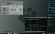
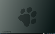
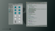
Still with an old desktop image, forgive me for the 3rd time ![]() Yesterday, I tried to find something interesting, but I was not fitting. Then this background seems calm and silent. I'm holding it a little longer.
Yesterday, I tried to find something interesting, but I was not fitting. Then this background seems calm and silent. I'm holding it a little longer.
8810
Offline